
Without the right user interface, lots of candidates could require lots of clicks before all the preferences are put in order.
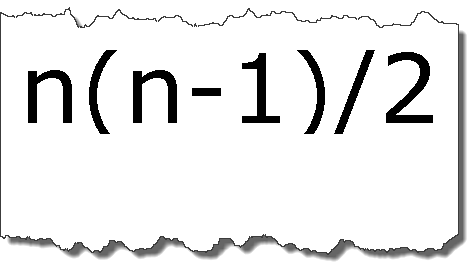
Here’s a handy formula that expresses a key virtue of ranked-choice interfaces over head-to-head pairwise evaluations… N(N-1)/2.
Head-to-head interfaces are typical of “Whose hotter?” sites such as candobetter.com. The point is to simplify the task of evaluating a long list of options. Users view a randomly selected pair of images from a large set, and then select one. The choice is recorded and another pair of images is displayed. It’s fine for idle entertainment since it’s so easy. Of course, the typical user gets bored and quits long before all the options are exhausted. Why? N(N-1)/2.
The reality of N(N-1)/2 boils down to this: As the number of candidates to be evaluated increases by 1, the possible number of pairwise evaluations grows at an increasingly higher number. The growth is less than half the rate of an exponential increase, but significant nonetheless. The underlying math is simple and straightforward, as Larry Bowen demonstrates, with significant implications for interface design.
One of the most advanced head-to-head crowdsourcing applications currently online is AllOurIdeas.org, a Google-funded project led by Princeton-based Sociologist Matthew Salganik. It’s a serious, text-oriented approach toward what Salganik calls “Bottom-Up Social Data Collection.” It’s been used to help small groups design their web sites and to help US citizens discuss national priorities. But even a site as sophisticated as that can’t escape the fundamental challenge of N(N-1)/2.
With just two choices per page, hot-or-not sites and AllOurIdeas benefit from having lots of room to display big, engaging pictures or crisp easy-to-read text boxes. On a per page basis, that space-saving approach leaves little room for confusion. But problems arise as the list of choices increases. It taxes respondent patience and undermines the accuracy of results.
Imagine a comparison of just 6 candidates in a hot-or-not styled contest. According to N(N-1)/2, the various names would be seen a total of 30 times. The voter or survey taker would have to click through 15 pages of pairs before a full ordering of preferences is possible. Even worse, someone could easily enter contradictory rankings, for example choosing A over B, B over C, and C over A. This “rock, paper, scissors” problem is known to mathematicians as intransitivity. People might fail to remember how prior choices were ranked, presuming they even bother to try. Or they might change their minds as they get cranky in the middle of a long survey session.
Things gets worse as lists get longer. Not exponentially worse, but enough to ruin the experience. Contests such as the 2012 GOP Presidential debates, which typically presented 8 candidates, would require 28 pages. A 12 candidate reality show such as a season-starting American Idol would require 66. A top 25 list such as college football’s Bowl Championship Series would require 300.
The bottom line is that a hot-or-not interface might be ideal if the only two choices are, say RCV versus hot-or-not. It might also be appropriate if the site owner’s main interest is to run up page views. But it’s a very different story when serious multi-candidate evaluations are called for, accurate responses are important, and an efficient user experience is desired.
An earlier version of my article is at my other blog… Comparing Ranked-Choice and Pairwise Evaluation User Experiences.